

In the ever-evolving world of design, maintaining consistency across projects is crucial for a seamless user experience and a strong brand identity. Figma, a leader in collaborative design tools, has introduced a powerful feature known as variables, which revolutionizes how designers create and manage design systems. In this article, we’ll delve into Figma variables with real-world examples, showcasing their impact on design consistency and efficiency.
Understanding Figma Variables
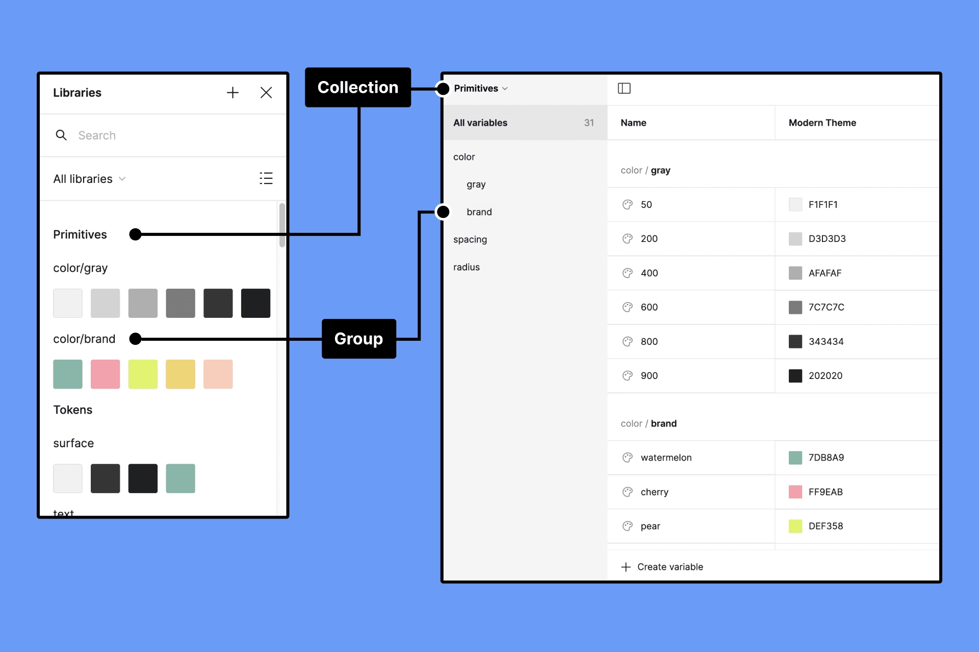
Figma variables are predefined values that can be applied to various design elements, ensuring uniformity across a project. These variables encompass properties such as color, typography, spacing, and more. Let’s explore the key features of Figma variables through practical examples.
Consistent Color Palette
Consider a scenario where you’re designing a website with a specific color scheme. Instead of manually assigning colors to each element, you can create variables for primary, secondary, and accent colors. If you decide to update the primary color later, the change instantly cascades throughout the entire project.
// Figma Color Variables
$primary-color: #3498db;
$secondary-color: #2ecc71;
$accent-color: #e74c3c;
Now, if you need to adjust the primary color from blue to green, a single update to the $primary-color variable reflects the change across all instances in your design.
Typography Harmony
Typography plays a crucial role in user readability and brand consistency. With Figma variables, you can define font families, sizes, and weights in one centralized location.
// Figma Typography Variables
$body-font: 'Roboto', sans-serif;
$heading-font: 'Montserrat', sans-serif;
$base-font-size: 16px;
By linking text elements to these variables, designers can maintain a cohesive typographic style. Should the need arise to adjust the base font size, a single modification to $base-font-size updates all associated text elements across the project.
Effortless Spacing Management:
// Figma Spacing Variables
$base-spacing: 8px;
$medium-spacing: 16px;
$large-spacing: 24px;
Spacing is a critical aspect of design, influencing the hierarchy and flow of elements. Figma variables simplify the management of spacing values, providing a consistent rhythm to your designs.
When designing components with consistent spacing, such as buttons or cards, designers can link padding and margin values to these variables. Adjusting the base spacing ensures that the entire layout adapts seamlessly.
Real-World Examples
Let’s explore how Figma variables can be applied in a real-world design scenario: a mobile app interface.
Theme Switching:
Imagine designing a mobile app with light and dark themes. Figma variables allow you to create a theme variable that controls colors for both modes.
// Figma Theme Variables
$light-theme: {
  $background: #ffffff;
  $text-color: #333333;
};
$dark-theme: {
  $background: #2c3e50;
  $text-color: #ecf0f1;
};
By toggling the theme variable, the entire app interface seamlessly transitions between light and dark modes.
Button Styling:
Designing consistent buttons throughout an app is simplified with Figma variables.
// Figma Button Variables
$button-background: $primary-color;
$button-text-color: #ffffff;
$button-padding: $medium-spacing;
Apply these variables to all button components. If you decide to change the button background color or padding, a single update to the corresponding variable ensures uniformity across the app.
Conclusion
Figma variables empower designers to create and maintain consistent design systems with ease. By embracing these variables and applying them in real-world examples, design teams can streamline their workflows, foster collaboration, and adapt to changes efficiently. The examples provided showcase the versatility and power of Figma variables in achieving design harmony across diverse projects.

Elina Carter
Elina is a content strategist and digital solutions expert at Hibiscus Technolab. With a keen eye for design trends and a passion for crafting user-first web experiences, she specializes in helping businesses grow through tailored WordPress development, SEO, and marketing solutions. When she's not optimizing websites, you’ll find her exploring UI/UX innovations or writing about the latest in digital technology.